Thursday January 3rd, my second day back at work. The weather was cold but clear, with low fog that burned out by mid-morning. But as I walked along Bute to Georgia, I enjoyed the unusual feel, the romance of the fog… and then, Georgia Street.
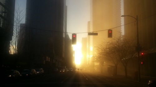
I’d already noticed that, depending on the time of day, the morning sun shines straight up Georgia like downtown was Stonehenge or something. A cool effect usually, but with the fog… it was beyond gorgeous. I took a couple pictures with my handy new Android phone (almost better than I’d take with my Canon G10, and light-years ahead of my pokey old iPhone 3GS. But I digress).
Here’s the picture I took:
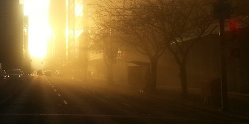
Later, I cropped it and set it as my Twitter and Facebook header, like so:
You’ll notice I tried a little clumsily to remove the traffic lights at the far right. The pedestrian walk signal wasn’t too hard, but the traffic signal just wouldn’t go away. I guess there was enough fog in the air, and the light was strong and/or omnidirectional enough that there was a bit of haze around it. I didn’t even notice this when I photoshopped it, and then it really bothered me for a while. It looked out of place in that composition, the only red patch in a sea of gold and black, but I couldn’t find any way to cleanly take it out, or tone down the colour. So, oh well, I guess it stays.
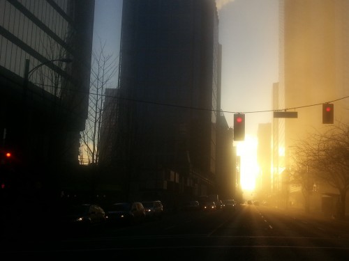
And then, a few days later, I started playing around with that picture again, trying for different compositions. I’ve said it before and I’ll say it again, that kind of thing doesn’t come naturally to me. Here’s what I came up with. First, a bit of cropping, and different aspect ratio. Still centred on the sun.
I like this one. The proportions of the buildings are more pleasing. Not exactly sure why; maybe it’s just because the crane is gone. Or, maybe it’s because the picture is more symmetrical. I think I would have preferred it to be completely symmetrical, with the sun shining exactly up Georgia… But hey, maybe complete symmetry would be boring! I don’t know. And maybe it doesn’t matter. You work with what you’ve got, am I right?
While we’re wishing, I would also have preferred not to have those overhanging traffic lights in the shot. Oh well. Next time I’ll wait for the light to be just right, or at least move to the east crosswalk so the traffic lights aren’t a problem.
Now here’s another composition, focusing on the dark buildings.
Basically I just wanted to follow the Rule of Thirds, with the sunrise being an obvious focus point. What was not obvious was that the building in the center would end up neatly dividing the picture vertically in thirds as well. Cool.
Letting my eyes do the thinking for me, I’m much more drawn to the line of cars still in the shade. This photo is much darker, which brings out their headlights. I kind of want to see movement, the cars emerging from the sun… maybe it needs different composition to really bring it out? If so, I just need to keep practicing.
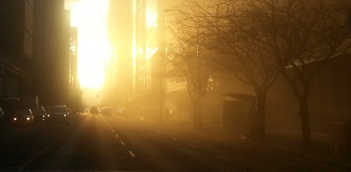
And here’s a slightly different look, even more postcard-worthy, I think. This time I’ve eliminated the problem of traffic lights by cropping them out entirely.
But the moral of the story is: every photo has a story to tell, and the best part is that it’s a different story every time. And step by step I’m learning how to bring out these stories out of the places and things I see.


