WordCamp: Developers

Yesterday was a very, very good day. Why? Because I went to WordCamp: Developers, that’s why! A whole day of knowledge, hot geeks, and interesting people. Though I’ve been tinkering with WordPress for a few years now, I’ve been starting on larger projects for other people (both volunteer and paid). It’s exciting and a little scary.

Yesterday was a very, very good day. Why? Because I went to WordCamp: Developers, that’s why! A whole day of knowledge, hot geeks, and interesting people. Though I’ve been tinkering with WordPress for a few years now, I’ve been starting on larger projects for other people (both volunteer and paid). It’s exciting and a little scary.

Keynote

The keynote consisted of Lorelle Van Fossen interviewing Andrew Nacin. Okay, kinda different, but I totally didn’t mind. First impressions: even with that playoffs beard, Nacin is hot. And used to be a fireman. Seriously. Second impression: he loves what he does, and inspired the same kind of love in the audience. “Innovation is the key to WP’s success,” he said. Things like menus, internal linking, even the current design, started out as pieces of code in various themes and plugins. Who knows where our little ideas will lead us?

Also, “Never trust the user.” But that’s a bit less inspirational.

HTML5 & CSS3 Integration For WordPress

Ray Villalobos took us on a whirlwind tour of these new technologies’ features. I was already familiar with some of them (border radius, semantic tags, transparencies) but at the end of the hour, my brain felt more than full. And I still had five more talks to go!

One quibble, though: As informative as it was, Ray’s talk didn’t really have anything to do with WordPress per se. I understand that a good WP developer has to know these things, but they apply to any Web development work. So… should they have been in a WordCamp event? I’m still undecided.

Developing a Control Panel for Multiple Sites Using the Same WordPress Theme

O HAI. Toby McKes works at Cheezburger Networks, the people responsible for bringing you lolcats (and Fails, and Squee, and Graphs) each and every day. I know, I couldn’t believe our humble city could be so honoured.

But bringing laffs to the world takes a lot of hard work. In the early days, all their blogs were running on different hacked themes, they all looked at least a bit different, and maintaining them was a huge headache. The solution was a unified theme, with dozens and dozens of theme options, controlled via a custom admin panel. This made installations a breeze, since they were all running on the exact same code. They even have a tool for importing and exporting options, too!

This really resonated with me, because one current project involves implementing a site with lots of custom options. I don’t need a full-blown admin panel for multiple installations… but it’s good to know others are dealing with similar issues.

Unconference: Finding Work as WordPress Consultants

I decided to skip the WordPress e-commerce talk (though I heard later it was very informative) and headed over to the Unconference track for a little discussion with Lloyd Budd on making money with WordPress. I’m honestly not sure if I have enough experience to really make a go at it just yet, but I want to know what options (and obstacles) lie ahead. We discussed CodePoet and other consultant-finding sites, and shared personal insights. No insights from me right now, but maybe next year…

Tackling JavaScript for WordPress

Again, lots of information, great if you want to get into fancy web development, but not directly related to WordPress. (Almost as an afterthought, he did mention wp_enqueue_script()). But I have to say, I loved how enthusiastic, yet low-key Allen Pike is about JavaScript. The way he says “Mind-blowingly awesome code you’ll learn a lot from” in an adorkably deadpan voice is just awesome.

Challenging Traditional WordPress Design

So you’ve got your traditional blog design with all this extra navigation in the sidebar: categories, tag clouds, recent posts, etc… Is it useful? Do people read them, or do they just tune them out? Catherine Winters looks at various site designs and relevant studies and concludes that, no, they’re not that useful. That a lot of these frills are in fact making pages harder to read, and that today’s web designers are ignoring lessons learned over centuries of print design.

Catherine’s delivery could have used some polish, but her ideas were right on the money. In my last blog redesign I deliberately cut out all the sidebar bits she mentioned. My inspiration, in part, came from AdamSchwabe.com, whose blog was even more radical in its minimalist design. And worked beautifully.

Possibly the Strangest WordPress Project You’ve Ever Seen in Your Life

That’s really what the schedule said. And holy shit did it deliver. Mark Reale led us through the design and implementation process of 6q.com, a site he did for artist John Oswald. It’s a trippy thing, loaded with crazy JavaScript animation, but it really does run on WordPress!

Oh, and I won a book at the end of this talk, too. Jesse James Garrett’s The Elements of User Experience. Go me!

Final Thoughts

So, that was WordCampDev. The organisers did a fantastic job, and I love these events because there’s so much to learn and absorb, and I come home so inspired! Looking forward to Northern Voice next week!
WordPress Options

I’ve been working on a project that involves reimplementing a site in WP. This specific setup requires quite a bit of custom logic, including several dozen options. It’s interesting work, and I feel I’m really stretching myself as a WordPress developer.

I’ve been working on a project that involves reimplementing a site in WP. This specific setup requires quite a bit of custom logic, including several dozen options. It’s interesting work, and I feel I’m really stretching myself as a WordPress developer.

Options in WordPress are easy to do. My first exposure to them was from looking at various themes’ options, but when you get right down to it they’re very simple. It all comes down to three little self-explanatory functions, that may be used anywhere in a theme:

set_option('option name','option value');
get_option('option name');
delete_option('option name');

That’s it, that’s all you really need. Now, a good theme or plugin will put in a lot of extra logic to make options pages nice and user-friendly. For instance, Erudite will structure options in a multi-level array, like so

$erdt_options = array (

	array(	"name" => __('Dark Colour Scheme','erudite'),
			"desc" => __("For all the dark colour lovers out there",'erudite'),
			"id" => $shortname."color_dark",
			"std" => "false",
			"type" => "checkbox"),

…and so on. Each field has a name, a description, a type (for the options screen), an id (used to retrieve and store the option) and a default value (“std”), for when a user wants to reset a theme. All of these are completely optional and depend on how the developer wants to built the options page. Unlike Drupal, there doesn’t seem to be a standard API.

The code might look something like this (again, taken from the Erudite theme):

foreach ($erdt_options as $value) { 
  switch ( $value['type'] ) {
    case 'text':
    // display one text field
    case 'select':
    //display a dropdown
  }
}

And to display one field:

<input name="<?php echo $value['id']; ?>" id="<?php echo $value['id']; ?>" type="<?php echo $value['type']; ?>" value="<?php if ( get_option( $value['id'] ) != "") { echo get_option( $value['id'] ); } else { echo $value['std']; } ?>" />
        <?php echo __($value['desc'],'erudite'); ?>

As you can see, each input field has its own ID, in case you want to do a bit of styling. Personally I would also add a general class to cover all fields, or maybe different classes for different types.

Saving these options is also quite simple:

foreach ( $erdt_options as $value ) {
  if ( isset( $_REQUEST[ $value['id'] ] ) ) { 
    update_option( $value['id'], $_REQUEST[ $value['id'] ]  );
  } 
  else {
    delete_option( $value['id'] );
  }
}

I’m ignoring all questions of where all this code fits in the functions.php file, where to place options pages in the admin section. That’s a topic for another day; I’m just going through the basics for my own benefit, and that of anyone who reads this.

WordPress Queries

A little while ago I had to display author pages for posts of a certain custom type. Let’s call it “portfolio.” Now, I’m still learning, but my understanding is that author page templates require the following logic:

A little while ago I had to display author pages for posts of a certain custom type. Let’s call it “portfolio.” Now, I’m still learning, but my understanding is that author page templates require the following logic:

  1. Go through at least one iteration of The Loop (by calling the_post())
  2. Use the_author_meta() or get_the_author_meta() to get the author info you want and display it accordingly
  3. If you also want to display the author’s posts on this page, call rewind_posts() to (you guessed it) rewind The Loop, or build a whole new query

You don’t need to explicitly build a query at the start of the template. That’s automagically taken care of you by WordPress. However, if you want to get more specific, here’s how it’s done:

global $wp_query;
$args = array_merge( $wp_query->query, array( 'post_type' => 'portfolio' ) );
query_posts( $args );

The first line makes the query object (which is a really complex beast I’m just starting to wrap my head around) visible to the script. The second adds an extra argument to the query string. The third performs a new query. Pretty simple, right?

Mind you, for author pages the above code is only necessary if you’re doing step (3). Otherwise you’re good.

The New Look

Well, that took a lot longer than I expected. But then these things usually do, right?

Well, that took a lot longer than I expected. But then these things usually do, right?

The design really only came together in the last couple of months. I remember at Northern Voice I was still struggling with placing a daily photo on the front page, with all the headaches that would entail. I still think it’s a cool idea, but I just couldn’t make it work. On the other hand, I’ve still got Sunset Beach and the West End in my header image. Right now it’s a static photo, but with a bit of thought I’m sure I could make it dynamic…

The other thing that pulled everything together was playing with Twenty Ten. As soon as 3.0 came out I dove right in and started building a new child theme. In hindsight Twenty Ten might not have been the best place to start, since a lot of my layout ideas came from a beautiful theme called Erudite.Though the documentation for Erudite mentions specifically that it’s for writers, I’ve found that it does pretty well for any content. (Hell, my inspiration, the lovely Life For Beginners, is very photo-heavy, and it works quite well.) I was attracted to Erudite’s clean and open layout, with minimal content in the sidebar, and had decided then that blogrolls, category archives, or what have you, could either go in the footer or just disappear.

Mind you, Twenty Ten is a great learning tool, so it certainly wasn’t wasted time. At WordCamp one of the speakers said you should try to develop your themes from scratch, because when adapting existing themes you may wind up with unknown design issues or unnecessary features. True enough (for example, I’m not using half of its widget areas): but I’d never gotten so deep into a theme before, and at least now I have first-hand experience of all these features I may or may not need.

What else? A lot of little things: threaded comments, gravatars, an honest-to-gosh contact form, courtesy of the excellent Contact Form 7 plugin. A redone blog archive page, inspired by that of Equivocality, and using the same plugin, Smart Archives.

Also, I decided to drop categories and go with tags. For a while I thought about using both, but every category scheme I came up with was either (a) so broad it became useless, or (b) so fine-grained it might as well be a tag cloud.

And finally, a portfolio! I’ve been talking about my volunteer web design projects for a while now, so why not show them off?

My Adventures With WordPress 3.0, Part 2: Featured Images

I’ve been playing around with the Twenty Ten theme, which incorporates a wonderful feature called Featured Images. Those have actually been around since 2.9 (where they were called “thumbnails”), but I’ve never gotten around to exploring them.

I’ve been playing around with the Twenty Ten theme, which incorporates a wonderful feature called Featured Images. Those have actually been around since 2.9 (where they were called “thumbnails”), but I’ve never gotten around to exploring them. Mark Jaquith explains all about thumbnails / featured images, but here’s the bottom line: FI’s are just like any other attachment, except a given post or page has at most one. Thus they can be used to visually represent that post in archives and search pages (as a thumbnail), or displayed in the post itself (full size), in any number of ways—inserted in the post body, for example, or maybe used as a custom header image like Twenty Ten does. I’m sure there are a million other options.

And all without mucking about with custom fields! All you need to enable this feature is to add three lines to your functions.php file:

add_theme_support( 'post-thumbnails' );
set_post_thumbnail_size( 50, 50, true ); 
add_image_size( 'single-post-thumbnail', 400, 9999 )

The second and third lines set the dimensions for the image either as a thumbnail, or in the single post. From doing a bit of experimenting, it looks like only the first two are required. As the name implies, add_image_size() registers different image sizes, to be used in different contexts: search pages, main page, what have you. set_post_thumbnail_size()‘s third, optional, argument (and add_image_size() fourth argument) determine whether or not the image is hard-cropped (by default, it is not). WordPress’s editor UI lets you determine the cropping for images that don’t fit the preset proportions, easy as pie.

Note that the switch in terminology from “thumbnail” to “featured image” only happened in the last few months, and is still ongoing even in the official documentation.

This is a wonderfully easy-to-use, yet very versatile, feature; I’m working on a project for which it’ll be absolutely perfect. Stay tuned…

My Adventure With WordPress 3.0, Part 1: The Install

They say the journey of a thousand miles begins with a single step. With that in mind, this is the first of a series of posts about me exploring Wordpress 3.0. I’m working on a new project involving a fresh 3.0 install, so I thought I’d jot down a few thoughts on the install process.

They say the journey of a thousand miles begins with a single step. With that in mind, this is the first of a series of posts about me exploring WordPress 3.0. I’m working on a new project involving a fresh 3.0 install, so I thought I’d jot down a few thoughts on the install process.

For one, it’s dead easy. Granted, Dreamhost lets you the one-click install thing, which takes care of all the messy db details, but I still remember going through a few more screens when I initially installed WP (granted, that was a few years ago, so maybe I’m wrong).

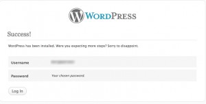
One interesting aspect of the one-screen config process is that you get to choose your admin account name, a great security feature

Success!

Another interesting tidbit (very bottom of the initial config screen) is the option to block search engines. For the moment I am blocking them, because this site is obviously not ready for prime time. Site visibility is managed in the Settings > Privacy page.

Search Engines Blocked

Mind you, that setting’s not unique to 3.0, I’d just never noticed it before.

Next up: probably something about child themes, or custom post types. I’ll be working with both those features.

Vancouver WordCamp

So I’m finally blogging about WordCamp. I had a great time, met some cool people, and learned so much I almost needed an extra brain. Well, I had my iPhone, does that count? Now I just need to digest everything I’ve absorbed and apply it to my present and future projects.

So I’m finally blogging about WordCamp. I had a great time, met some cool people, and learned so much I almost needed an extra brain. Well, I had my iPhone, does that count? Now I just need to digest everything I’ve absorbed and apply it to my present and future projects.

It was such a beautiful day. I strolled down to Vanier Park via Burrard Bridge, unused to getting up so early on a Saturday, but not really minding, because the streets were peaceful and quiet. Then I got a little lost, because I wasn’t too clear on just where the Vancouver Museum was. Turns out, it’s attached to the Planetarium. Huh. How long has that been going on?

Socializing Your WordPress Blog

The first presentation was by Nadia Aly, showing various social media tools to add to your blog. Facebook, Twitter, Digg, Stumbleupon, all these and more should be used to bring more readers in, and add value for your established readers.

  • Tweetmeme, a retweet button. Also shows how many times a post has been tweeted. Available as a WordPress plugin or standalone as a bit of Javascript code.
  • Facebook share. Same as above, but with Facebook.
  • Social Bookmarking Reloaded adds a series of graphical links to all kinds of social media sites, from Facebook to Delicious to… a whole bunch I’ve never heard of. Seriously, there are over 60 options.
  • Flickr Photo Album, a plugin that allows you to insert Flickr photo sets or individual photos in your posts
  • WP Followme adds a Twitter “Follow Me” badge to your blog
  • Facebook Like button plugin: exactly what it says on the tin
  • Twitoaster automatically tweets your posts as they’re published.

And that’s only the tools Nadia explicitly recommended, I’m sure there are a million more.

WordPress Dev Environments: MAMP and WAMP

Wouldn’t it be great if you could set up a WordPress install right on your own machine, to poke and tweak and experiment to your heart’s content, play with the most unstable beta builds without worrying about taking down your live site? John Biehler introduced us* to MAMP (Mac, Apache, MySQL, PHP), a completely self-contained environment separate from the existing Apache server on MacOS. Wish I’d known about this before; in the future I won’t have to set up a subdomain with a separate WordPress build to test new themes. Hey, live and learn.

(* Well, me, at least)

WordPress As CMS

A panel of three speakers (Cameron Cavers, Christine Rondeau and Dave Zille) discussed how WordPress can be used as a CMS, using some great examples of “non-WordPress-looking” sites. Here’s one. And here’s another. They argued that it’s even appropriate for small static sites, because though it may take a little more time to set up, updating becomes much easier. Plus, you’ve got things like the versioning process, to help clients not panick. With the coming of WordPress 3.0, with its custom post types and menuing system, CMS usage will become even easier, though still limited. For instance, there’s no built-in approval process, though there are kludgy workarounds (e.g.: conditional displays on certain custom fields, each one acting as a signoff).

Some interesting CMS-related plugins mentioned in this discussion:

  • Improved include page: lets you display multiple subpages on a template. Great for reusing snippets of text without mucking about with widgets!
  • Pagetree lets you view your pages in a tree structure, in the admin panel. Great if you have a complex page hierarchy!

Being Curious for a Living

Why ask why? Lauren Bacon argues that asking questions of your clients leads to better sites and loyal clients because you get to the meat of what they really need instead of what they think they want. You want a new widget? What purpose will it serve, exactly? How will this fit in your business strategy? WHY DO YOU WANT THIS NEW FEATURE? Answers like “Everybody’s doing it” are not acceptable.

Instead of writing from my notes, why don’t I link you to Lauren’s post on her own presentation?

Designing For WordPress

Colin Ligertwood is the speaker here (and I am just totally in love with his logo). Among other things, he coaches designers in working with WordPress. Unfortunately I didn’t take extensive notes for this talk; I think it’s because not a whole lot was new to me.

  • He advised designers to create our themes from scratch. The problem with adapting existing themes is that there may be unknown design issues, unnecessary features, or may not be appropriate to the content
  • Speaking of, content may be unpredictable, so we should design accordingly. Allow for both very short and very long posts
  • Keep navigation simple
  • The 960 grid system is really awesome, and I can vouch for it. I’ve already used it a bit for some quick prototyping.

WordPress and Drupal

WordPress is:
joyful, resourceful, quick

Drupal is:
flexible, dragon-slaying, comprehensive

Amye Scavarda comes to us all the way from Portland, to talk about how to decide between WordPress and Drupal for a given project. What sets Drupal apart from WordPress is that it’s so powerful. It is a sword, and if configured right it will slay any dragon you want; but use it wrong and it will cut you.

Will you need many different user roles? Are you building a large content-heavy multisite? What do user needs? How much training?

The dividing line between WordPress and Drupal is blurring just a tiny bit, though; with its new features, WP 3.0 is becoming a pretty robust CMS (as we’ve already seen). This cross-pollination is a good thing in the end. It shouldn’t be WordPress versus Drupal, both have different strengths and different niches.

Here are the slides for Amye’s talk

Parent-Child Themes And Frameworks in WP 3.0

The bottom line here, say Tris Hussey and Catherine Winters, is that WP 3.0 is an evolutionary, not revolutionary, update. Custom post types, just to pick one example, were around in 2.9, there just wasn’t any real front-end to manage them. Still you’ve got a lot of really neat stuff in this version, like custom menus and child themes.

Child themes are great. Tris gave a simple example of a child of Twenty Ten, the new default WordPress theme. All it took was one CSS file, consisting of two lines, in addition to a few bits to refer to the parent: one overriding the header graphic, and one to show a new font. Simple, but it got the point across. It looks like all you need in child themes is to add whatever styles (and templates? I’m not too clear on that) you want to override. Easy-peasy.

Get Found Easier: SEO Tips For WordPress

Tell you what, I’ll just link to Mark McLaren’s site, McBuzz.com. It’s got the slides for his talk. Bottom line, WordPress is already quite good at SEO, with its customisable permalinks, post description, etc… Of course, you have to choose good keywords (and figure out which keywords will actually lead people to your site), but WordPress can’t do everything, eh? There are other tools to help you along, such as:

Closing: Art and Technology are Old Pals

Goddamn, but Dave Olson is fucking hilarious. Oh, also smart and insightful. He took us on a roller-coaster ride through his past, mixing and matching metaphors with the greatest of ease, from the bottom of the Grand Canyon to Moab, Utah, from floppy disks to WordPerfect to CB radio to blogs. Art and technology together, open technologies and open data, people chatting with each other as equals, they’ve been around for a lot longer than I (for one) thought. And we, valiant WordPressers, are continuing that proud tradition.


WordCamp ended around 4:00, with a social on Granville Island at 6:00. How to kill a couple of hours? Well, first, I could explore the Museum of Vancouver. They were kind enough to give WordCamp attendees the run of the place for free, so I got to look at some fascinating exhibits on Vancouver’s history, and a bit about shoes. Kinda cool, but anyone who knows me would tell you I’m not one for fashion.

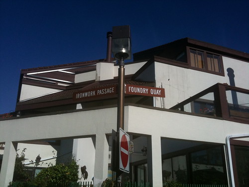
Then I went for a walk. The weather was still sunny and fine, so I moseyed along the seawall towards Charleston Park and Stamp’s Landing. Very pretty neighbourhoods, with a spectacular view—close to downtown, close to everything, lots of bike and pedestrian access, what’s not to like? If I’d had my camera I would have taken more pictures, but all I had was was my dying iPhone. Still, here’s something, mostly because it intrigued me:

Ironwork Passage & Foundry Quay

Ironwork Passage & Foundry Quay

Now those are some weird street names for such a residential neighbourhood. But then I thought back to the history exhibit, especially this map right here (the museum had a colour version). Back in the day, this place, as well as Yaletown, were places of industry. Did you know there used to be a rail bridge linking downtown and what’s now Vanier Park? How things change. Nowadays, the only train you’ll see in Yaletown is the old locomotive in the Roundhouse.

Had another blast from the past in Stamp’s Landing, too, but that’ll have to wait for another day. It’s a much longer story, and not connected to WordCamp.

Progress means…

In the last two years I completed the VGVA.com redesign, to much applause; I began and will soon finish another redesign, which introduced me to an honest-to-gawd CMS (WebGUI, to be precise). And yes, I already knew Wordpress, but I’d only adopted that in the previous year. Recently I’ve begun two more projects, one (volunteer) as part of a team of developers, another as the solo tech guy for a fledgling online commercial venture.

Hey, remember when I wrote

How much do I really know about Web design? Sure, I read a lot of designers’ blogs, but I’ve got exactly two sites under my belt: this one right here, plus another one for an online RPG I’m no longer a part of, that I redid maybe six years ago. That’s it. Just two. Not a great portfolio. A lot of people will be judging this, and judging me on it. Am I really up for this challenge?

In the last two years I completed the VGVA.com redesign, to much applause; I began and will soon finish another redesign, which introduced me to an honest-to-gawd CMS (WebGUI, to be precise). And yes, I already knew WordPress, but I’d only adopted that in the previous year. Recently I’ve taken on two more projects, one (volunteer) as part of a team of developers, another as the solo tech guy for a fledgling online commercial venture.

I’m fretting especially about project (b), because though it may be possible to implement it in WordPress, we’re still hammering out the requirements and I may have to turn to Drupal. Which would mean learning Drupal. On the other hand I’ve been meaning to do so for a while now, not least of which because it’s an extremely marketable skill, and now I have a good excuse. On the gripping hand it’s intimidating, because the project’s bigger and the stakes are higher.

So yeah, the fears and doubts are still there. The difference is, my comfort zone is much larger now, and I’m getting insecure about bigger and scarier things.

And that, my dears, is progress.

File sorta not found

Well, the site itself works just fine, but it looks like there were a few issues left to deal with.

First, Wordpress wasn’t returning the right status code (404) when a requested page couldn’t be found. That was easily fixed. Returning the correct HTTP status is not too important for human browsers but is a huge deal for search engines because when you’re indexing the Web you need to know which pages actually exist.

Well, the site itself works just fine, but it looks like there were a few issues left to deal with.

First, WordPress wasn’t returning the right status code (404) when a requested page couldn’t be found. That was easily fixed. Returning the correct HTTP status is not too important for human browsers but is a huge deal for search engines because when you’re indexing the Web you need to know which pages actually exist.

The status code was only part of the problem, though. See, what WordPress does when you use custom URL rewrites (as I do) is, if the requested URL doesn’t map to an existing file, the request is redirected to a custom error page. The annoying side effect is that as far as the server is concerned, a file was delivered correctly and no error is logged. Which messes up my stats. Fortunately, there’s a solution: a WP plugin called Redirection. It handles 30* redirections as well as keeping a log of 404 errors. The former isn’t necessary for now, since only gallery & photo URI’s have changed—and I have to use .htaccess to handle those, since they’re outside WordPress, but the latter is a godsend. Not a perfect solution, since in a perfect world I shouldn’t even have to use workarounds, but I’m very happy with it.

Oh, and AWStats (the stats package I’m using) was counting each browsed page twice. Seems a gallery page (.php, which is counted as a page view and not just a hit) is called in the background to build the photo grid displayed in the sidebar. Fortunately AWStats allows you to ignore certain pages, and this won’t be a problem in the future.

Curtain Up!

Well, hey, that was pretty painless. I was worried about having to move my Wordpress installation from one directory to another, but it went off very smoothly. Of course, then I had to do a bit of cleaning up, re-upload my images, and so on.

So here we are. 6+ months of work, on and off at times, have finally paid off.

Well, hey, that was pretty painless. I was worried about having to move my WordPress installation from one directory to another, but it went very smoothly. Of course, then I had to do a bit of cleaning up, re-upload my images, and so on.

So here we are. 6+ months of work, on and off at times, have finally paid off. I have harnessed the powers of WordPress and Gallery (and the synergistic power of WPG2) and come up with… well, something that’s pretty darn good, if I do say so myself. I mean, I could go the humble route and be all, “Oh, I still have a lot to learn”, which was actually my first reflex. And which goes without saying. But, comments! And a rich blogging interface! And Lightbox overlays!

I’m still going through the posts and pages, and testing internal links. URIs for posts (except the pre-2003 ones) haven’t changed, but those for photos have. Unfortunately, though Gallery does provide some URI rewriting ability it’s not nearly as versatile as I would’ve liked. Grumble, grumble.

Anyway. Enough about me. Enjoy the new site!